This tutorial teaches you how to design a responsive navigation or menu using CSS and jQuery.
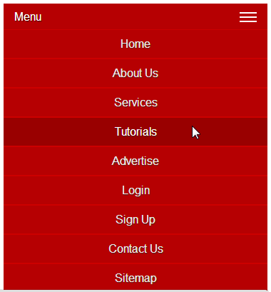
Responsive design has basically become a staple to any modern website. Having this in mind, navigation must be ready to adjust to the various screen sizes possible. As you'd imagine, a 10 item long horizontal menu doesn't translate well to a cellphone' screen. However, with a bit of proper tweaking, we can make a proper responsive menu for use on mobile or small screen size.


Responsive design has basically become a staple to any modern website. Having this in mind, navigation must be ready to adjust to the various screen sizes possible. As you'd imagine, a 10 item long horizontal menu doesn't translate well to a cellphone' screen. However, with a bit of proper tweaking, we can make a proper responsive menu for use on mobile or small screen size.
No comments:
Post a Comment